


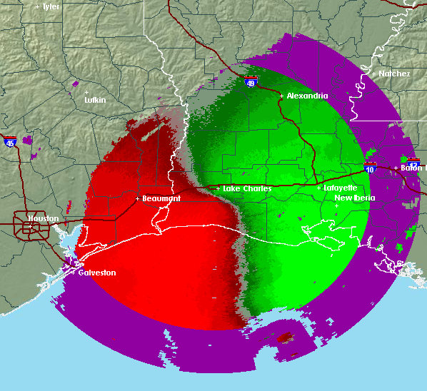
Base Velocity Explained |
This base velocity image is from the NWS Doppler radar in Lake Charles, Louisana during Hurricane Rita, September 2005. In
velocity images, red colors indicated wind moving away from the radar with green colors indicating motion toward the radar.
The transition zone between incoming and outgoing winds are indicated by the gray-ish colors between the two. Purple
indicates "range folded" areas (areas where the radar is unable to determine the radial velocity).
Composite/Base reflectivity image comparison
The direction of the wind can be estimated using this transition zone. From the radar, draw a line to any portion of the gray-ish area. The approximate wind direction is perpendicular to that line extending from the radar. Mouseover the image to view wind's direction indicated by yellow arrows.
The radar's location is indicated by a black dot. The light blue lines are radial lines extending from the radar. The arrows at the end of each line are perpendicular to these radial lines and indicate the approximate direction of the wind at the end point of the lines.
Notice the change in direction of the wind as distance from the radar increases. Why the difference? At #1, the radar beam is near the earth's surface displaying wind low to the ground. The wind speed is reduced slightly due to friction with the earth's surface. As a result, the direction is angled toward the area of lowest pressure, the eye of the storm.
Farther up in the atmosphere, above this frictional layer, the wind direction is more what one would expect (indicated by the large curved yellow arrow). Yet at #3, the wind direction begins to diverge. This divergence is clockwise outflow at the top of the storm.
We see these different wind directions through the height of the storm due to the radar beam increasing in elevation as the distance from the radar increases.

